PixMatch lets you snap a selfie and instantly find every photo of yourself across thousands of event galleries.
Concerts, weddings, sports events, conferences — photographers shoot you, then you wait days for a download link that often never arrives. Or you scroll through 2,000 frames trying to find the four where you're not blinking. PixMatch fixes that loop with one selfie.
Endless thumbnail-scrolling through unfamiliar event galleries to find a few photos of yourself.
Photographers deliver in batches — sometimes weeks later, sometimes not at all.
The frames that captured the night are stuck on someone else's hard drive, forever inaccessible.
Quick access to her photos from events without scrolling through thousands of frames.
Photographers take days to deliver. Most of her event memories are stuck on someone else's hard drive.
Posts immediately after an event. Prefers tapping over typing. Values trust signals before paying.
A tight palette and a single typeface family — Montserrat in five weights — kept the visual system disciplined enough to scale across 38 screens without breaking rhythm.
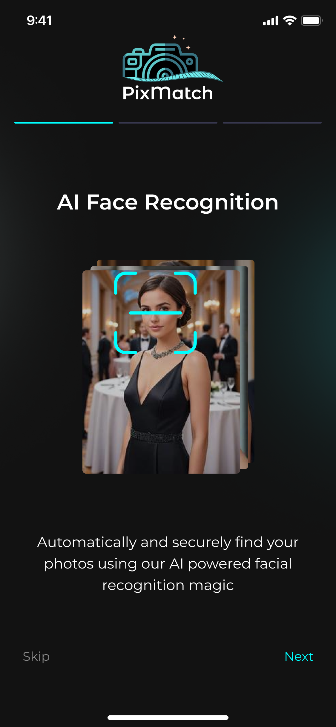
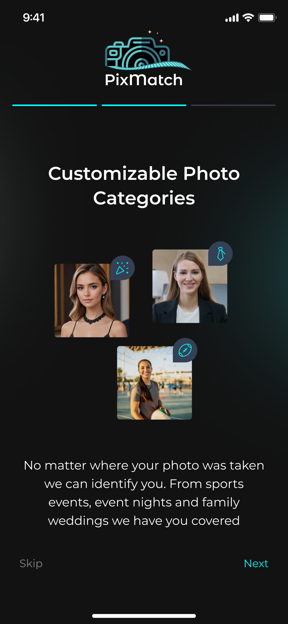
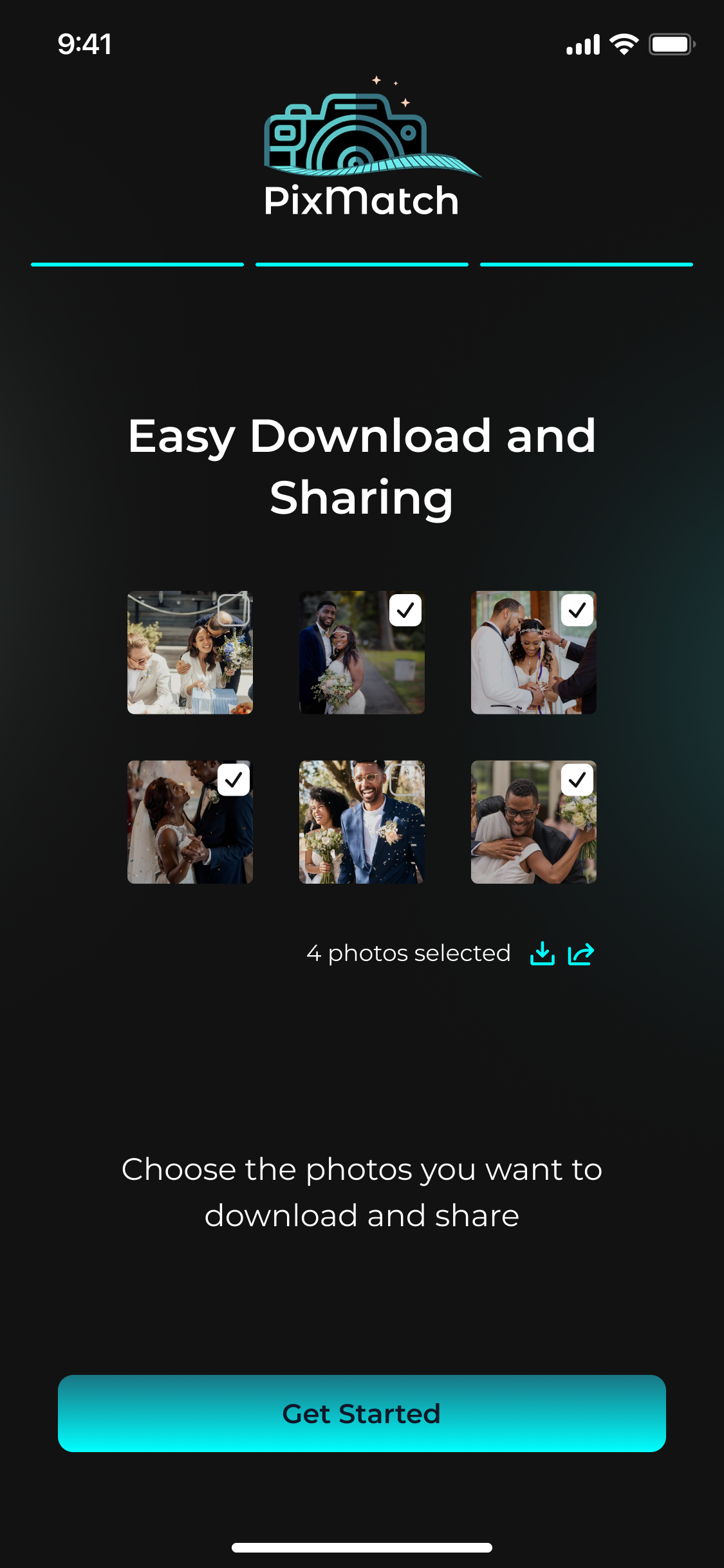
Onboarding sets expectations before the camera ever opens. Each screen does one job — explain face recognition, show the categories, preview the result — with friendly microcopy and a single Next button.
The result is a 3-tap journey that lands users at the home feed already knowing why they're there.

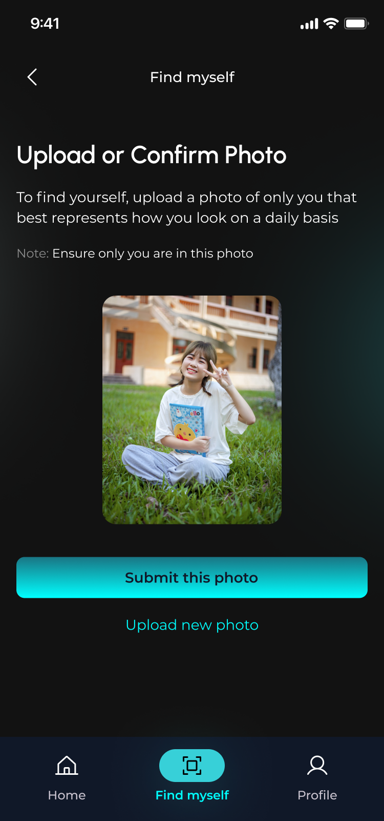
Upload one selfie. Microcopy makes it explicit — "only you in this photo" — so users never wonder what to submit.

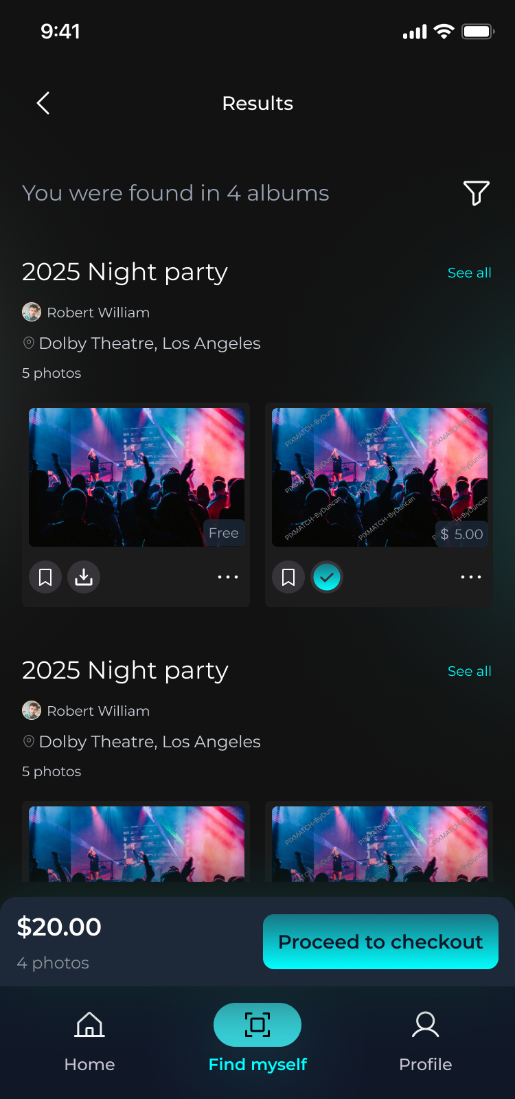
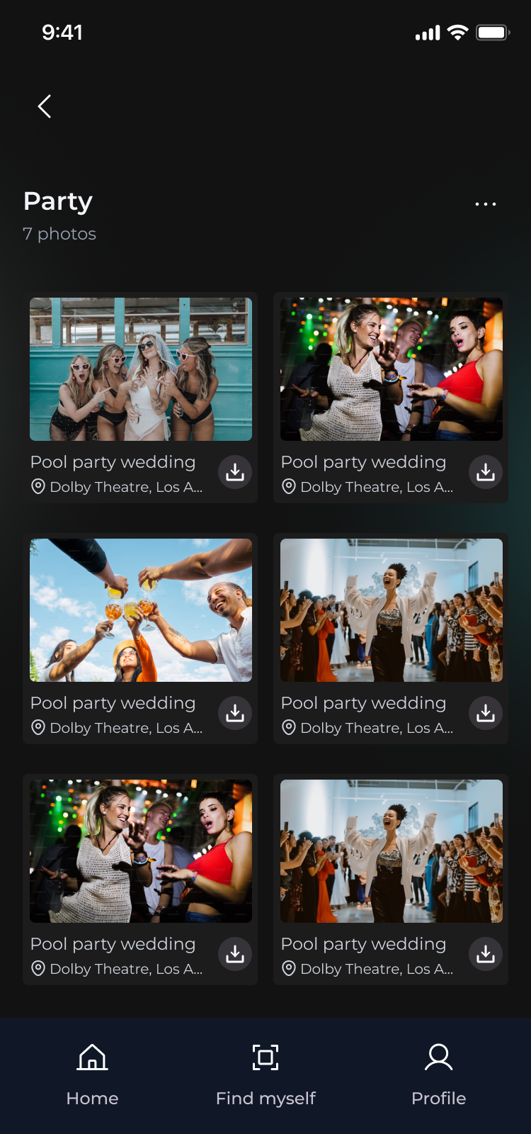
Matches are grouped by event with clear pricing. Free photos are tagged, paid ones priced. Selection updates the sticky cart in real time.

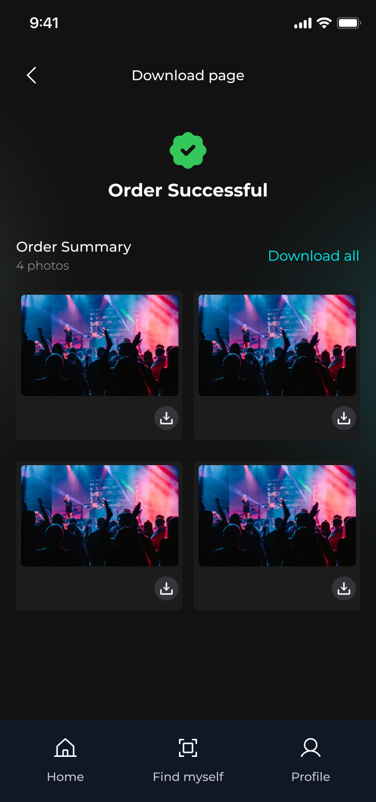
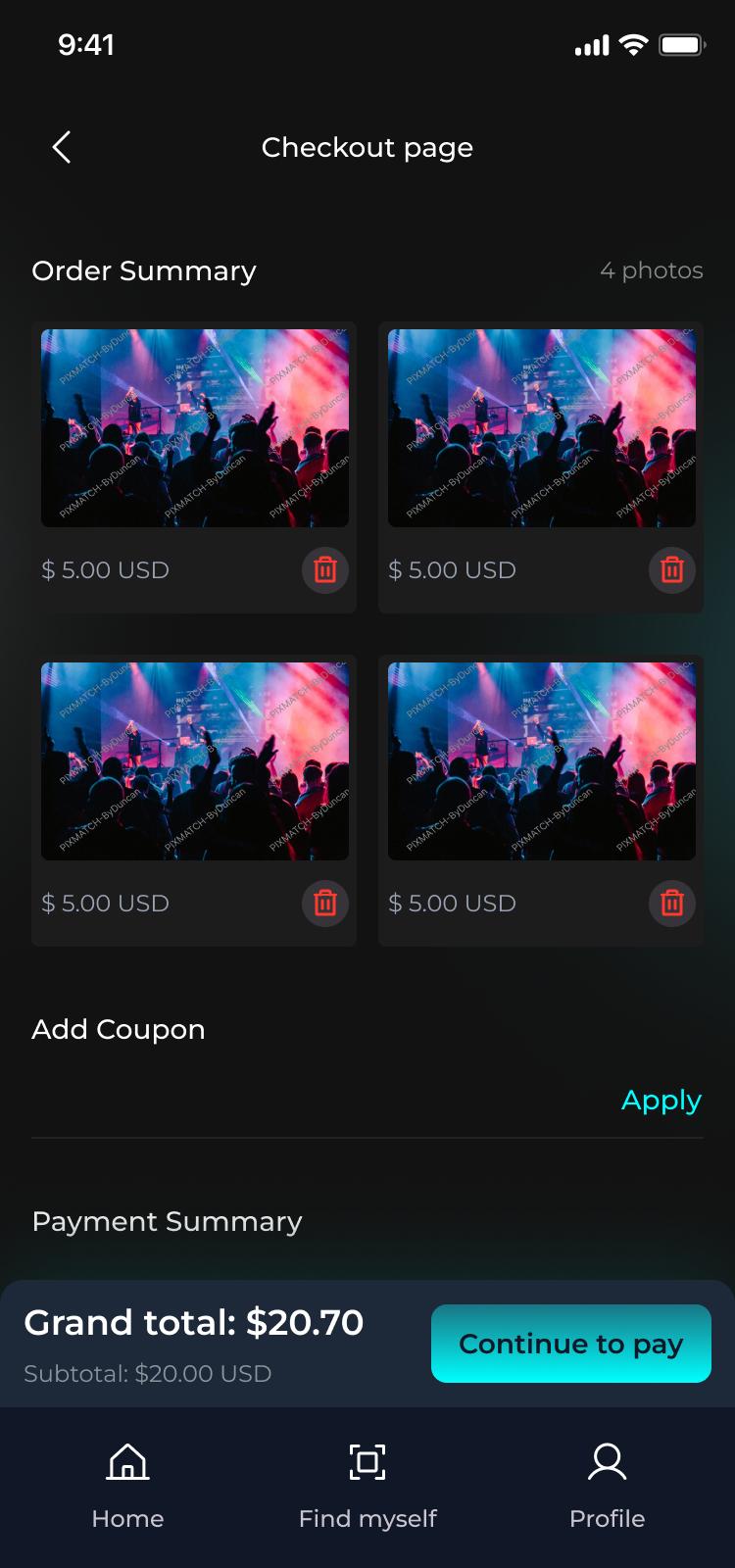
One sticky checkout bar, one confirmation screen, one tap to download all. The whole flow can finish before the event's even over.
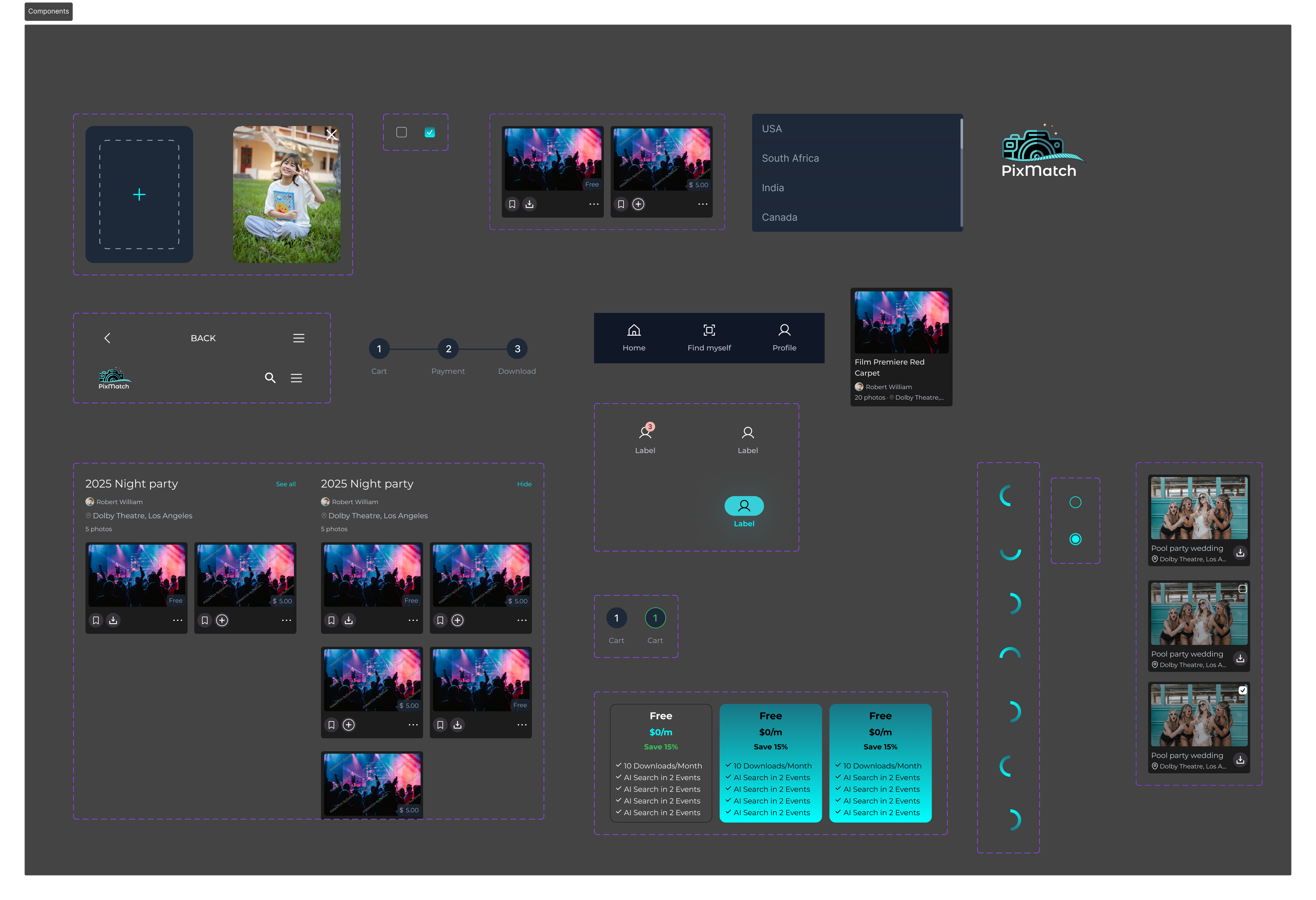
Before any screen was finalized, I built the component library. Every tile, badge, bottom-nav state, plan card, dropdown, and progress indicator lived in a single canvas — so swapping a button radius later took one variable change instead of forty hunt-and-replaces.
This is the part of the work nobody sees, and the reason every screen feels like the same app.
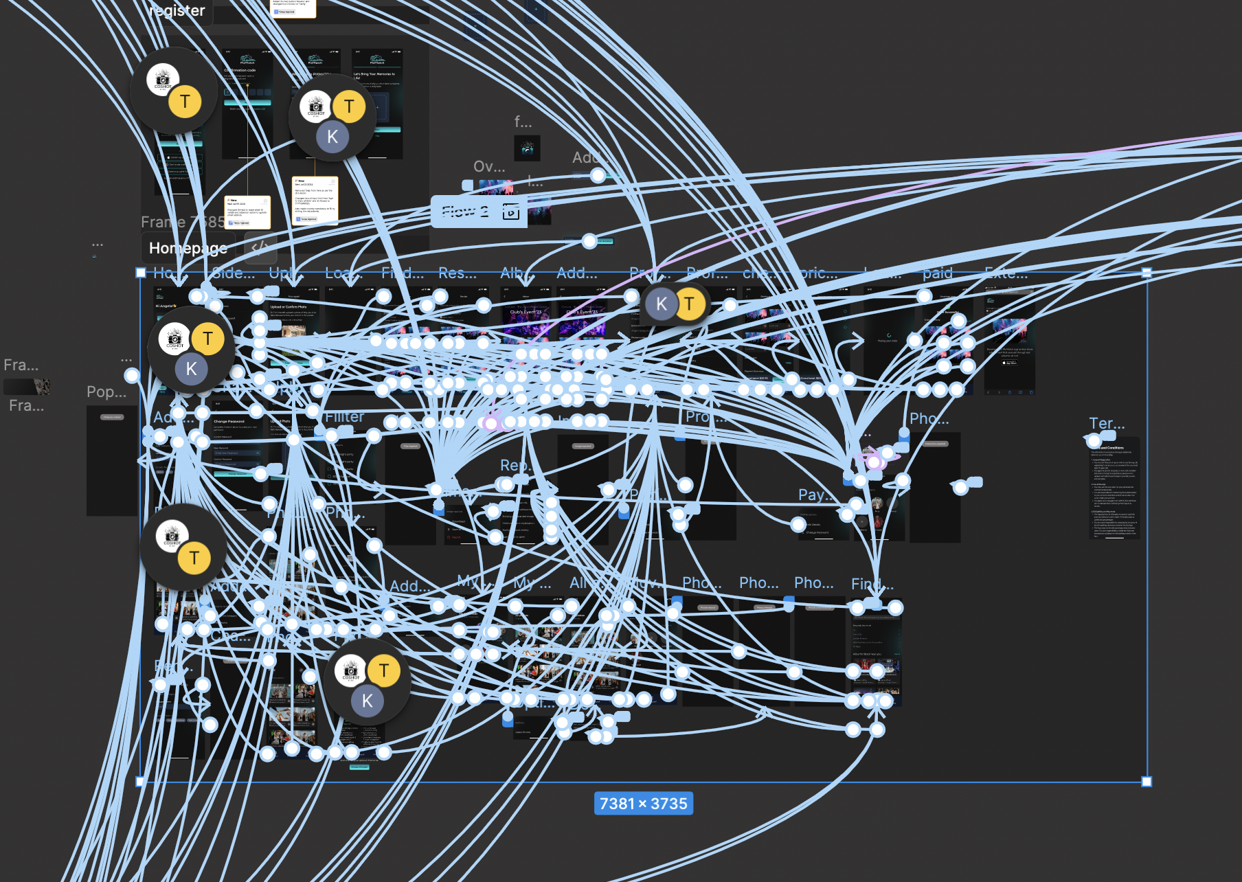
The clickable prototype isn't an afterthought — it's the only way to feel whether a flow works. So before handoff, every back button, modal escape, and edge state was wired up. The result is a Figma canvas that looks like spaghetti but plays like a real app.
Every blue line is a user decision I made before a developer had to ask about it.
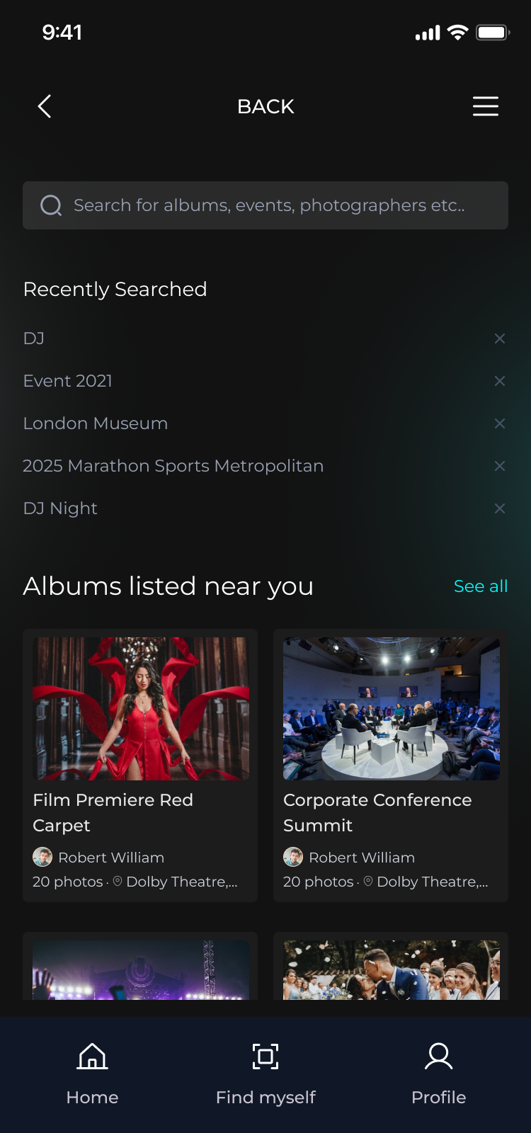
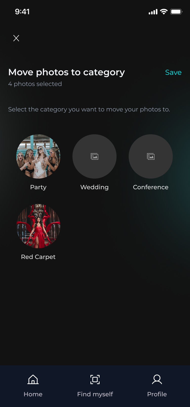
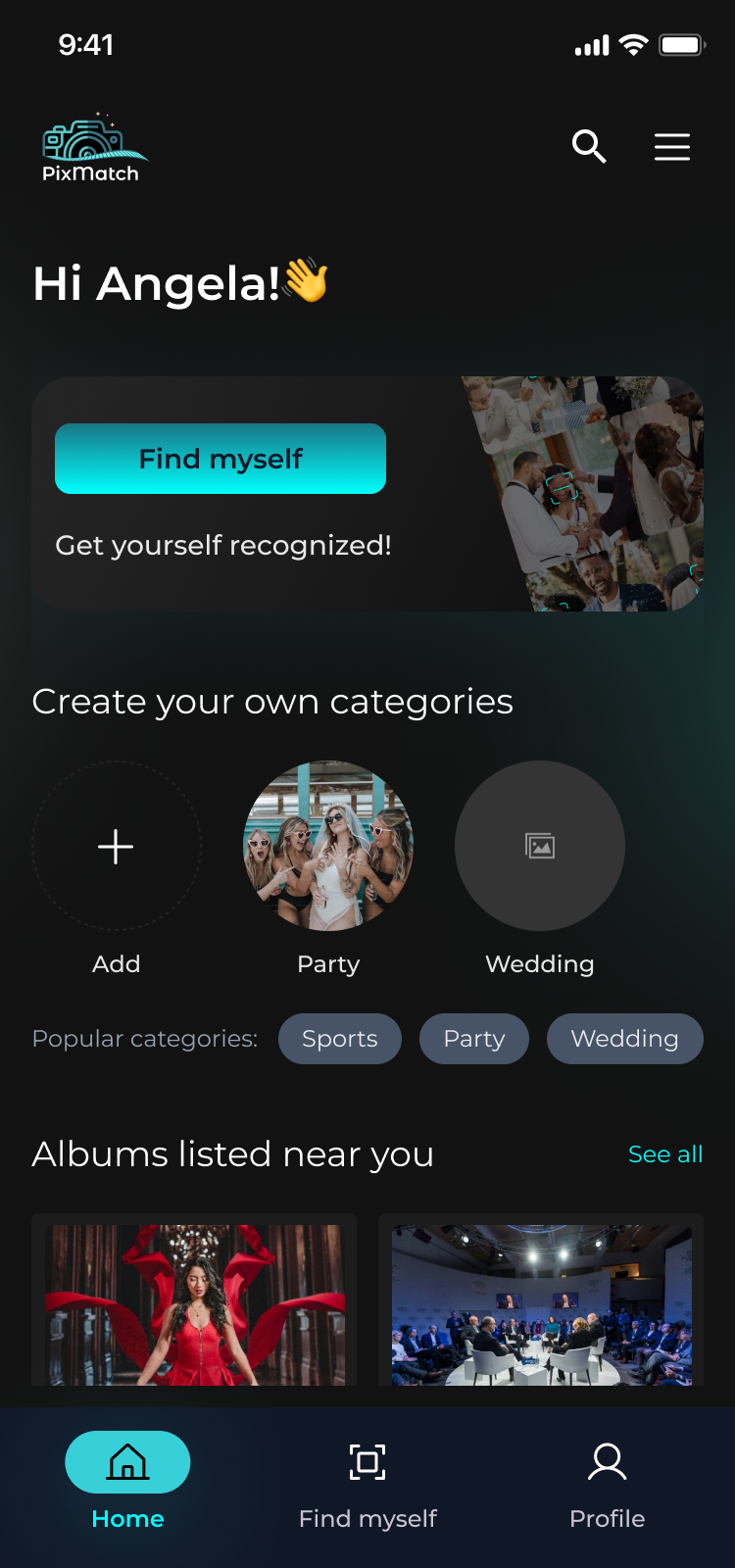
Hand-picked from the full flow. Each one anchors a specific decision — empty states, sticky bars, category management, trust micro-copy.